Monday, 21 April 2014

Broadcast: Annotations of the Storyboards

Here I have uploaded the final storyboards for my four Broadcast productions. Along with the images I have explained the choices of location, camera shots and angles, costume, sound, lighting and props.

Costume: Throughout all of the storyboards, the presenter wears the same costume: blue jeans, darker blue top with a design on, black jacket (if outdoors)and white converses.This allows the TV Spot to look continual and in form with each other. I decided upon this costume by asking the 'presenter' what she wears on a day to day basis. This is because, in the Lifestyle programmes which I researched (Kirstie's Handmade Britain, Alan Titchmarsh's Garden Secrets and Paul Hollywood's Pies and Puds) the presenters all wore casual, slightly smart, clothing that looked as if it was there own. Therefore I asked the presenter of my show what she wore usually and decided for that to be her costume- in order to reflect how other presenters are dressed in Lifestyle programmes. The casual look may also attract the demographic categories from B and below because those in the B category are likely to see the casualness as a contrast to professional dress in the work life and thus use the programme as a means of escapism (Uses and Gratifications). Those is the lower categories may identify with the casual dress and so feel part of the programme community, thus playing on the desire to belong (Maslow's Hierarchy of Needs).

Lighting: Also throughout the storyboards, the lighting is natural. This is because the use of natural lighting accompanies the effort to make the programme appear to be as close to lifestyle as possible. Media productions are an intentional  representation of life, rather than real life, therefore as my programme is to be in the lifestyle genre I used natural lighting to enhance the reality of the programme. The lifestyle programme which I have researched also appear to use natural lighting, indicating that natural lighting is a typical convention of the lifestyle genre. I did ensure, however, that filing would be on bright days in order to create a desired light atmosphere to the TV spots. This is because bright lighting is likely to attract females, who stereotypiclly prefer happier and more laid back programmes to males (such as sci-fi or horror)- which the bright lighting gives a feel of.

Sound: In all of the storyboards, I have decided to use the same non-diegetic background music. The background music is to be upbeat, instrumental and cheery. This is to apply to the craft theme of the show and also attract the desired target audience. The target audience is to have an interest in craft and have the psychographic of explorers and aspirers. The upbeat and cheeriness of the music is likely to uplift the target audience, putting them in their innate mind set of exploration and aspiration and thus evoking the desire to participate in the programme. It may also be that the music gives desired connotatations of craft and uniqueness which will apply to the target audience. Furthermore the music is likely to be enjoyed more by the target age range of 26-30 because, stereotypically, at a maturer age instrumental music i more enjoyed than at a younger age. However the facts that the music still contains a 'funky' element places the appeal solely on this age range whereas anyone older may prefer something calmer. Therefore the music is designed to attract the target age range. The music is to be non-diegetic because in the lifestyle programmes which I have researched the background music has been applied after the filming rather than within the filming. Therefore I followed this convention in order to fit in with pre-existing lifestyle productions. In some of the scenes the music is to be louder (as I have noted on the storyboards). This is where the presenter stops talking and a closer shot it made. I decided to use this because, after looking at the other lifestyle programmes which I researched (links above), I noticed that often the music would be louder when the presenter stopped talking and focus was placed on a different object or scene. This allowed the producer to keep the audiences attention on the programme instead of drifting away as the presenter is not there to engage the audience by speaking to them. By using this my production is inkeeping with the generic conventions of other existing broadcast productions.

Camera Shots and Angles:
For the establishing shot I used a Very Long Shot in order to encompass and set the scene (this was used in programmes which I had researched), allowing perhaps for the audience to feel as if they are actually there. This may tie in with the audience using (Uses and Gratifications) the programme as a means of identification (those who enjoy craft). Medium Close Up's allowed me to create a personal view from the audience of the presenter, perhaps establishing a connection between the audience themselves and the presenter. I used MCU's at the end of the sequence in each storyboard in order to finish on that notion of a personal bond. This may urge the target audience to watch the programme, especially as they have a psychographic of 'apirers' and so may feel the desire to aspire to be like the presenter within the professional area of craft. This also applies to the lower demographic categories who are not a professional in any area and follows Maslow's Hierarchy of Needs in which people are believed to have a desire to belong. Furthermore I decided to ue of a combination of Close Up and Medium Close Up shots to convey the craft side of the programme. I used such shots on the scenes of craft products in order to entice the target audience who enjoys crafting, thus attracting them to the full programme. This was a technique which I noted from my research into Kirstie's Handmade Britain where these shots were used to convey the same purpose.  I chose to use Long Shots and Medium Long Shots after looking at Alan Titchmarsh's Garden Secrets in which both of these shots were used when the presenter (Alan Titchmarsh) was talking to the camera in a rural setting. This allows the audience to see the presenter from many angles, thus getting familiar with the presenter. This is important for those who gain gratification from identifying with the presenter, especially as the presenter of my production has not been in existing media productions. Also in terms of the camera, for some MCU and CU shots I chose from the camera to move slowly from the left to the right. This allows for focus on the detail of props whilst encompassing the whole prop as well.

Props:
In all of the storyboards I have used props which have connotations of crafting (candles, cakes, fabric, sewing boxes, needles, interior decor). I noticed that props were important in attracting the target audience in the broadcast pieces which I have researched, therefore I used these props in the same way. The props are likely to appeal to the target audience who enjoys crafting because of the obvious craft connotations. Also, the hand made props (such as the fabric cushion cover, cakes and Christmas stocking) are likely to appeal to the lower demographic categories of the target audience. This is because it suggests a cheaper alternative to otherwise expensive objects (and so in terms of 'Use and Gratifications' can be used for money saving ideas). The colours of the props hold a way in attracting the target audience too. I have chosen pink in some of the props (such as the pink icing) because pink has connotation of feminism, thus applying to the gender of the target audience. Also, the hand made props may provide a challenge for the psychographics of the target audience. Being aspirers and explorers, the target audience may feel as if hand crafting provides a new 'challenge' to themselves, therefore drawing them in to watch the programme. The use of props, i discovered from my research, accompanies what the presenter is saying. I chose to use an abundance of craft magazine pages in Storyboard 3 in order to convey the sense of irritance that the presenter has in not being able to find an affordable interior, I then went on to one of these pages being crumpled and thrown by the resenter to further display the annoyance. Here, the props accompany what the presenter is saying and may also resonate with those in the lower categories who feel the same irritation. Through the use of props, then, I am able to attract the target audience to the programme.

Further choices vary for each storyboard:

Location:
Storyboard 1
Initially, the location is in Chichester in front of an idyllic prestigious manor house. I decided the use this as the location for the establishing shot and further few scenes because it is likely to appeal to the demographic category of B- who may identify with the connotations of wealth. Similarly this may appeal to the lower demographic categories of my target audience who also have the psychographics of 'aspirers' and aspire to own such an idyllic place as this. This follows the establishing shot of other craft programmes which I have researched where idyllic places are used. Further into the storyboard, I changed the location to a rural setting. This is because it resonates with the connotations of uniqueness that craft gives, thus applying to the psychographics of 'explorers' who aim to discover different things. I also decided to use this transition from the home to the rural setting because it fits in with the idea of a journey of craft (as said in the presenters script). Some scenes are also shown inside the home. I chose this location because it allows for the feeling among the audience of being accepted by the presenter into their personal life, thus (in terms of Uses and Gratifications) the target audience of craft lovers is allowed to gain gratification from identifying with the presenter who shares in the same interests as themselves and allows for a  'personal' bond to be created. This may entice the target audience to watch the programme.


Storyboard 3
The location of this storyboard is in the home of the presenter. Initially the scene is of the presenter as her desk in a room. I chose this location because it may allow the target audiences age range and gender to identify with the presenter in the decor of the room. Furthermore the idea of your own home gives the sense of new independence which my have also just come into the lives of the age range who are younger adults (26-30), thus creating the notion of identification. It also allows for the laid back feel to the programme and applies to the bond between the presenter and the audience. The storyboard then moves location into the presenters garden. This again applies to the bond between the presenter and the audience which may convince the target audience to watch the programme as they identify with the craft theme. It also applies to the title 'Country Crafting' which gives connotations of the outdoors, thus showing a pattern of continuity.

Storyboard 2
For the same reasons as previously mentioned, the setting of the presenters home is used. More importantly I chose to transition from the busy, chaotic, urban setting of shops at the beginning of the storyboard to the calm and remoteness of the rural outdoors at the ending. For one this accompanies what the presenter says at the beginning of the storyboard, but it also follows the Narrative Theory. There is the disequilibrium in which the pressure of society (urban setting) distracts people from being who they want to be and then the new equilibrium where the presenter offers a retreat to be unique (rural setting). Through the manipulation of the setting to follow the Narrative Theory  my production may entice the target audiences psychographics of explorers, and the idea of problem solving may appeal to the lower demographics who may struggle with such problems with identity themselves.

Storyboard 4
I chose for this to be set in a larger room to give the idea of a craft fete or club, especially in the props of the tablecloth. This allows for my production to appeal to the target audience of craft lovers because it may gives the idea of a craft society which creates a sense of belonging (as previously mentioned, a factor in Maslow's Hierarchy of Needs). This is also true of the setting of the art rooms, which may evoke a sense of artistry within the passions of the target audience, thus inviting them to stay tuned and watch the full programme. I also incorporated the setting of the outdoors, again, to apply to the name of the programme and create that sense of uniqueness in the detachment from society which may be desired by the target audience who has a psychographic of 'explorers' and 'aspirers'- who aspire to be something different.

Tuesday, 1 April 2014

Print Media: Final Designs and Explanation of Choices

These are screenshots of the final designs of the Front Cover, Contents Page and Editor's Note. I have written why I chose to use these designs, how they apply to my target audience and how they use the design and conventions of Lifestyle Print Media.

Front Cover:
Design and Conventions
By using the initial research into existing print media products I was able to produce the front cover in correspondence with the typical codes and conventions used in the designs of the magazines. I altered the initial flat designs of the front cover, merging what I liked from both of the designs. By doing this, the front cover suited the conventions of lifestyle print better.
Adhering to the conventions my research noted, I used brief headings with description of the contents and situated them as a border around the focal point of the front cover image. I also incorporated the popular use of a colour scheme into the front cover by picking out the main colours of the images and using the same colour on the text and headings. This can be seen by the use of light pink (in text and text boxes) which corresponds with the light pink in the image and the use of light blue and white which also corresponds with the dominant colours of the image. The title of the magazine, however, flouts the colour scheme by taking on a darker red. I decided on making the title darker because, after looking at the magazine covers which I had researched, I noticed that the title was always the boldest colour on the page (another typical convention). It also appeared that the generic conventions for the title was for it to be enlarged and easily readable, thus I applied these conventions to my own print production. Further applying to the conventions of magazines which I have researched, I used capital letters and enlarged or different colour fonts to highlight text which is likely appeal to the target audience. I also created a theme to the magazine (Spring and Easter), after noticing the a few of the magazines used a theme as the basis of their issue.
Taking into account the further generic conventions I had noted from my research of any magazine, I also added the bar-code, price and month to the front cover. This is because the front cover holds key information about the magazine, therefore my production requires the inclusion of such material. I situated the bar-code at the bottom of the magazine and the price and month at the top, following the layout of two magazines which I had put a large focus on, as both applied to a similar target audience as my own.
Country Living and Good Housekeeping together formed a large basis for the design of my front cover. I noted from both that the word 'Plus' in a bold, different coloured font was used and incorporated the use of this into my design. This is because it appeared to be a convention used by lifestyle magazines, thus I thought it would be fitting to apply to my lifestyle print production. I also incorporated other elements of the magazines into the ideas for my own front cover. The use of the green label in Good Housekeeping inspired my idea to have a gold label on the front cover of my magazine which reads 'BRAND NEW MAGAZINE'. I used the idea of a slogan before the title and further subheadings ('Hello Spring' and 'Explore the world of Craft'), taking into account the design of 'Country Living's front cover. The image on the front of Country Living's issues (as I has noted in my research) is never of a person but of something applicable to the magazine's theme. I decided to incorporate this particular element of Country Living's house style, and used an image of items associated with the contents and theme of my magazine. This is down to the fact Country Living has a very similar target audience to mine.

Applying to the Target Audience
I noticed in my research of magazines that colours were manipulated to suit the target audience. In consideration of this I decided to use light pink as one of the theme colours on the front cover. This is because light pink connotes feminity, thus applying to my primary audience of females. The title is a darker pink, in order to attract females whilst also standing out, as it is bolder, from the rest of the front cover. This allows the audiences attention to be directed to the title of the magazine in competition of other magazines. The font style of the title and headings also holds importance in attracting the intended audience. For the title I chose to use a basic, but slightly unique, font in order to be easily readable (as something difficult to read is likely to deter the audience whereas something effortless is likely to attract) and apply to the target psychographics of 'explorers'. This is because the uniqueness of the title may suggest something other than a mainstream approach, thus enticing a psychographic of 'explorers'. The subheadings of 'Hello Spring!' and 'Explore the world of Craft' use a italicised font which looks handwritten. This connotes individuality, but also has a sense of regality to it, applying to the target audience demographic category of 'B' who may desire something more up-market. The connotation of individuality,too, applies to the psychographics.
The actual content of the text on the front cover is designed to attract the lower demographic categories and the age range. The use of 'Plus!' may intruige those in a lower category than 'B' who are likely to desire additional features for the price (being in lower paid occupations). This is the same for the used of '5 BRILLIANT MONEY SAVING IDEAS' which is in capitals to attract the attention to the money saving', attracting those in the lower categories. This also applies to the Uses and Gratifications in which the audience may use the magazine to spark ideas for a cheaper alternative to an expensive hobby. The use of 'Krafts with the Kids' plays on the word craft to add that sense of individuality to the magazine (attracting the desired psychographics) and also aims to attract the age range of 21-35 year olds who are likely to have younger children, thus harboring a desire to share their hobbies with their children. I decided to colour the label gold because gold connotes wealth and quality, which accompanies the text of 'brand new magazine', suggesting that the magazine offers both. This may attract the demographic categories who both desire quality and wealth, and want to show off that they have wealth. The text in this gold label is capitalised to stand out, 'brand new' connotes rejuvenation which people thrive for, thus attracting the audience.
The image holds a key part in attracting the audience. As already mentioned I decided to use an image of a scene rather than of a person because of the similarities in target audience with Country Living, so the use of such image may also attract my target audience. I used natural lighting for the image, however ensuring that the lighting was light rather than dark. This is because a lighter image is likely to attract an audience who enjoys crafts because it gives connotations of simplistic enjoyment. The actual content of the image has the sole purpose of revealing what the issue contains whilst attracting the targeted audience of craft lovers. This is because the images uses props involved with crafts: paintbrushes, flower arrangement, baking and sewing. The props also apply to 'Uses and Gratifications' as those who enjoy crafting may gain gratification from identifying with the connotations of the props (of crafts, hobbies etc), and may use the magazine for crafting ideas (applying to those in the B category who may be professionals in a craft area). I also ensured that the image had a dominant colour of pink (connoting feminism, and so attracting the female audience) and blue (the colour associated with Easter and so tying in with the Spring/Easter theme). For the image I used a Medium Shot in order to encompass the scene whilst also focusing on the props, and perhaps making the audience feel as if they are there due to the closeness and encompassing nature of the shot. This has the aim of showing the craft, attracting the target audience of those who enjoy crafts, and creating a sense of belonging, thus attracting the audience who desire to belong (Maslow's Hierarchy of Needs).
The language used, such as 'The ultimate craft magazine', has the purpose of attracting a audience of craft lovers by providing competition with already existing magazines. The conventions in which the magazine front cover follows (talked about previously) are used to attract a general audience who purchase print media.


Contents Page:
Design and Conventions
A typical convention of the content pages, which I discovered from research and annotations, is to have a basic, bold title for each contents description. I incorporated this convention into my own design in order to fit in with the original conventions of the print magazine industry. Differently, the descriptions (which are a few words, basic and short) are not bold, thus I adhered to this convention which I had noted, ensuring that the description for each of the contents title was simple, short and unbolded.  I also noticed that the text on the contents pages was structured in short columns. This was to take a systematic approach to the contents by grouping it into themes. However my magazine, being the first issue, does not yet have any traditional or expected contents to group it under. Therefore, I simply applied the convention on laying the text out in columns. One of the main conventions of the contents pages, which I gathered from my research, was to put the corresponding page number next to the text. I used this convention in order to direct the reader straight to the described contents. This also allows for the producer to glance over the scheduled layout for the contents, ensuring that all of the correct contents has been included in the magazine issue. Additionally, images appeared to be used on all contents pages which I researched, with a corresponding page number. This allows the reader to visually glance over the contents and immediately be directed to the corresponding page. After annotating contents pages, as well as looking at other magazines, I noticed that credit to the photographer was always given in a small, capitalised font down the side of the page of one of the images. Therefore I added credit down the side of the top right image, in order to fit in with the generic conventions of magazines which allow for recognition of other contributors. Adding to this, I put the magazine name, issue and month in the 'header' of the contents page which appeared to be another convention used by magazines. I also added the page number in the bottom left corner, which is a generic convention of all magazines to guide the reader. I started the magazine with the contents on page 5 to allow for advertisements on the previous pages which usually take up the first few pages of lifestyle magazines.
I decided to incorporate the layout of Country Living into my design for the contents page, again due to the similarities in contents and audience. I framed the contents with the images, adjusting the images so that they were positioned at an angle. Accompanied with the rose page border (which applies to the rose-inspired contents) and the borders of the images this gave an effect of a scrapbook. I decided to make the theme of this page almost like a scrapbook because it fits in with the topic of craft. I also used the idea of the page title in small, lowercase font because it creates a welcoming tone rather than I large title being emblazoned over the first page of the magazine. In terms of the font, I kept it basic for this page. This is because after looking at the font used on the contents pages of other magazines I noticed that the generic font was something basic with a slight twist. Therefore I added this to my design in order to adhere to the conventions of existing contents pages.
 I chose a light purple page background appeal to the female audience and in consideration of the fact a white background made the page look empty and unfinished, thus I chose a colour slightly of white. The paleness of the background also allows the text and images to stand out (one of the corrections I made from the feedback). The images I used relate to the contents, I used a variety of camera shots for different effects. For the image of the presenter I used a Medium Close Up to create a personal relationship between the reader and the presenter, inviting them to watch my broadcast piece, for the other images a combination of Close Up and Very Close Up shots were used to allow for sole focus on the craft productions. Each image as light in order to add to the cheery vibe of the magazine.

Applying to the Target Audience
I adhered to the convention of a colour scheme, which I chose to be pink and purple. This is because pink was the dominant colour in the images, and purple complimented the connotations of the pink. Pink connotes femininity, thus applying to my primary target audience of females. I ensured that a basic font was used in order for the audience to glance at the contents which may intrigue the audience in itself. This leads onto the choice of contents. The contents relates to the Spring/ Easter theme, to the psychographic and the demographics of the audience. By relating the contents to the theme, a sense of community is established in the fact that a seasonal change and festival is being celebrated together. Thus, this may attract the target audience in terms of Uses and Gratifications- the target audience (whose hobby is crafting) may gain gratification from identifying with other individuals who share in their passion. This also goes for the content such as 'Memoirs of Master Crafters' and 'Scrapbooking Frenzy!'. When considering the audience demographics, I chose contents which which apply to the range of categories from B to lower. 'Really Brilliant Money Saving Craft Ideas' and 'Treat Yourself' applies to the audience demographic category of C and below, who look to save money. Additionally, 'Blueberry & Lavender Muffins' has connotations of something more upper-class, with the unique twist on the traditional blueberry muffin a sense of individual style is created. In terms of psychographics, 'Unique Cookery Gifts' applies to those who want to 'explore' new things and 'Memoirs of Mater Crafters' applies to those who 'aspire' to go forward in the crafting industry. As mentioned before, 'Krafting with Kids' applies to the 21-35 age range who ar likely to have children and share their passion for crafting.
The images alone are also used to attract the desired audience. I chose to use images of crafts that look 'girly' and has feminine connotations, this is because the primary audience is females. The images along with the corresponding page numbers allow those who may have a busier work life (such as professionals in the B demographic category who are likely to have extra work, and the age range of 21-35 who may need to cater for the needs of children or complete university work) to take a quick glance at the contents and visually see what the magazine offers, and be immediately directed to the pages which draw their attention. The use of a scrapbook style layout (positioning and sizing of images and borders) relates to the main interest of the target audience- crafting. Thus, this may appeal to the audience who may notice the association of the layout and crafts. In addition to this, the page border adds to the idea of a scrapbook, but also contributes to the feminine look of the page with the pink flowers, aiming to attract  females.

Editor's Note:
Design and Conventions:
The design of the editor's note for each magazine differed, however I did find some generic conventions which were used among them. For one an image of the editor was always used. In the two which I annotated, the image of the editor was quite a focal point. For this reason I decided to make a collage of images, however positioning the image of the editor on top of the other images, so that it holds more importance. I also noticed signs of convergence on the editors page. In Good Housekeeping, the magazine's website was advertised at the bottom, similarly in Country Living all the magazines social networking sites were arranged in a row at the bottom of the page. I incorporated this convention into my magazine, considering the E-media platform (which I have not chosen to do for the brief). I created three social networks (Facebook, Twitter and Instagram) and a webpage for the magazine, positioning them with the network logo in the footer of the page. The layout of Country Living inspired my choice of layout for this.
I noticed on thee magazine editor notes which I had researched, that the editors signature was printed at the end of the editors' writing. I used this convention, and added the signature of the editor for my print production to the end of the editor's introduction. Along with the image of the editor, other images were always used, therefore I incorporated other images relating to the content of the editor's note. I also ensured that I had included the page number (in the footer), magazine name, month and issue (in the header) as I had done with other pages, following the conventions of other existing print products. I also noticed that some of the editor's writing was bold or italicised. I applied this convention to my on magazine in order to highlight key information or draw the reader'r attention to specific parts of the text. For the same reasons are enlarged some text, whilst keeping other parts at a basic font. Once again, I included credit to the photographer after seeing that it was an important convention used in recognising other people who had contributed to the magazine. Furthermore, I noticed that the language style of the editors note pages always had a personal tone and was welcoming, thus I applied this concept to the language style of my own piece. This can be seen in the enlarged page title: 'Welcome!'.
The layout of the page, however, varies between each magazine. I decided upon a simple 2 column layout. This is because it allows two topics which the editor's note addresses to be separated into two basic sections, thus being easier for the reader to glance at. The  columns also adhere to the generic style of print productions which most often use columns in order to collectively relay information over to the reader. To separate these two columns, I used a thick dot border. Together with the pink framing in the collage of images (I noted that uses image collages was a popular house style used by Country Living) and the transparent background of the roses, the border goes along with the scrapbook effect which I aim to achieve in the layout of my magazine. This applies to the theme and content of crafting. The background, I decided on using a pale green because I deemed that white made the page look unfinished. The pale green allows for the same light effect as white, whilst also complementing the green/pink colour scheme (another convention) of the page. The colour scheme also fits in with the editor's piece on roses which enhances what the editor is writing about.
Keeping in line with conventions of magazine pages, I used a short introduction under the title and two small headings in order to summarise the content of the page. The font varies throughout the page. I applied a basic font to the actual bulk of the contents in order for the reader to be able the clearly read it. However for the title and subheadings I used an italicised font. I used this for the subheadings because it looks as if it has been handwritten, applying to the personal tone of the page, and the fact that the pages is the editor's 'note'. For the title I used a large italicised font to emphasise on the welcoming nature of the magazine.

Applying to the Target Audience
Convergence from print to E-media is shown at the bottom of the page. The promotion of social networking sites may appeal to the target audience age range of 21-35 who are more technologically savvy. This is because it means that the magazine can be used (Uses and Gratifications) for social integration by talking about it through the capabilities of social networking sites and joining the communities on social networking sites. This follows the water cooler theory: that in the workplace, topics are discussed in breaks. I have used images which are likely to appeal to the female target and the interest of the target audience in craft. Again, pink is used, connoting feminism to apply to the primary audience of females. The use of one primary figure and the welcoming tone of this figure (the editor) creates a feeling of a personal relationship between the editor and the reader, who may gain gratification (Uses and Gratifications) from identifying (interest of craft) with the primary figurehead. 'Welcome!' also creates a sense of community and belonging, a common desire of any reader (according to Maslow's Hierarchy of Needs). The layout, as before, is designed to appeal to the target audience with the look of a scrapbook. In relation to the audience psychographics, I chose to use the heading 'Step into our spring-time offering...' because it may evoke a desire to explore the issue with the coaxing language of 'Step into' and the use of ellipses. The language choice also serves another purpose (to the one previously mentioned in terms of conventions). Being more of a simple language choice and using colloquial terms such as 'soo' and exaggeration on exclamation marks ('!!') this may apply to a lower demographic category (C and below) who prefer to read something with less complex terms, equally the easy reading may apply to the B demographic category who want to escape from the complexities of professional work (Uses and Gratifications: escapism).

The research which I had done prior to creating my print pieces formed an essential part of my ideas for each design. From this research I was able to apply the correct conventions and purposely use elements of the design to attract the target audience.

Wednesday, 26 March 2014

Print Media: Initial Designs & Feedback & Problems

I used Microsoft Word to create the Print draft designs which I had previously drawn out. I printed these initial designs out and gave them to a friend for feedback, as well as looking over them myself. My friend gave me comments on what I had done well and annotated what I could improve.
These are the Initial Designs with the feedback annotations and comments, from which I shall improve upon and reach my final Print designs.

Together, me and my friend noticed several changes which I could make to the front cover. The images was a main problem, as it was not clear and the reader could almost see the pixels. Additionally, the text at the bottom of the page printed in a different size and font from the printer than it had showed up on my screen.

Screenshot of original font and size

 I printed this page twice to check the error and found that the issue may be down to the fact I had opened this Microsoft Word document on a different computer, thus it may have altered some of the layout. I will test this by printing via a different computer. Also, the colour of the text often made the text hard to read, meaning that I should change the colour in some areas. My friend suggested that I make the gold sticker slightly smaller as it takes up focus of the page, rather than the contents and title accompanying the gold sticker to attract the desired target audience. Another thing she noticed was that a dash border separated the images and the title section: not fitting in with the layout of the magazine. Together we decided that the front cover would look better without the border.

.
Each page that  printed, printed with a white border around the contents. This cut off some of the information which I had put onto the design (such as the barcode on the front cover). I looked into this and found that it was because the printer required room to grip onto the paper, however when I get the designs printed professionally the border is unlikely to (and should not) print. On this particular design the border cut off the page number and credit to the photographer, which my friend (who gave feedback) noticed. She also suggested to lighten the background colour which will allow more of a focus on the foreground text and images.

Design has a white background
 rather than light pink
When I first printed, the page colour did not print (the background to this was white although it was supposed to be a pale pink). I researched why this was and found that to do so, you can adjust the settings via 'Word Options' to print the page colour (shown in the screenshot). I then printed the page again, and the page colour also printed (which can be seen below).

 After getting the feedback, I noticed that my friend and seen some subtle errors which I need to correct. For one, I had cut off some of the text in the bold introduction. Also, the background of the editor's signature was white, rather than matching the page colour. She suggested that I centered the web-links more to the images as they appeared out of place.


By using this feedback I am able to test any issues which I have encountered and make changes to suit the audience better.

Monday, 24 March 2014

Print Media: Draft Designs

I created brief hand designs of my ideas for the front cover, contents pages and editors note, allowing me to see how my ideas would link to audience appeal (a key part of the brief). I based the designs on the new knowledge which I have gained through the research including the annotations and analysis of existing print media products. I did two designs for each of the three pages so that I could compare and explore my ideas. I will then choose the one which I believe to suit my target audience the best.


Front Cover


Contents Pages


Editor's Note


Sunday, 9 March 2014

Print Media: Annotations of Existing Media Products

I decided to print off pages from existing media products which I had already researched in to and which were are similar to my idea and annotate them. This helped me to take a deeper look into the house style of magazines which had a similar audience to mine, and so looking into the codes and conventions which are used and that appeal to the target audience.

Covers: Obviously my magazine will need to have a front cover, so I annotated existing front covers to see which codes and conventions are used to apply to the target audience. This would allow me to follow a similar style.


Contents Pages: I annotated contents pages because this is always the first page in the body of the magazine, therefore to make my magazine realistic I will need to include a contents page as one of my three pages.
Good Housekeeping


Country Living


Editor's Introduction Pages: After looking at a few similar magazines to my own idea (Country Living, Good Housekeeping and Waitrose Kitchen Magazine) I noticed that each one had an editors note and introduction to the magazine as one of the first pages. I decided to use this idea as the third page for my magazine, especially considering that it will be a new magazine in which the audience will want to know as much as they can about the background information.
Country Living


Good Housekeeping

Saturday, 8 February 2014

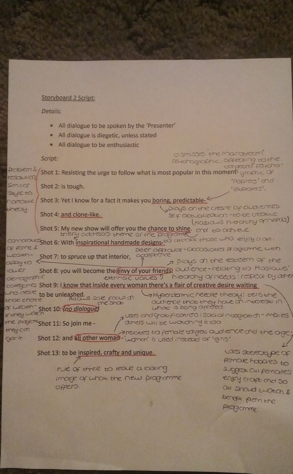
Broadcast: Scripts and Annotations

I typed up the scripts for each Storyboard to give to the 'Presenter' of my programme. In addition to this, I annotated the scripts to show my reasons for choice and how they apply to my target audience.


Monday, 13 January 2014

Audience Research (Questionnaire & Justification)


Audience

Questionnaire
I kept the questionnaire simple and quick by the questions requiring a tick in a box answer next to the field which applied to the person, or in some cases a single word answer. This is because if the questionnaire required long pieces of writing or complex answers, the person answering is likely to find it boring and difficult, thus producing less accurate or rushed answers. This would affect the reliability of the results. Furthermore it would allow me to easily categorise the already provided fields. All the questions which I asked had a purpose to investigating my target audience. I created the questionnaire using Microsoft Word.


Justification of Questions I Produced:
Question 1: This questions was important to allow me to see which gender would be most interested in the idea for my media piece. After pinning down the gender, I can begin to consider what attracts and appeals to the certain gender which will allow me to reach the target audience.

Question 2: By discovering the age range which my idea is most likely to appeal to I can combine the findings with the gender and consider what would attract the forming target audience. Also the age range can be used to determine the maturity of the productions and the register used in both production pieces.

Question 3: This question directly asks whether the user watches any TV in the genre which my production will fall in to. By collecting the result of this question and comparing them with the other questions I will be able to see if any factors influence the popularity of Lifestyle TV (for example if more older people prefer Lifestyle than younger).This will allow me to see expectations that different people may have from Lifestyle TV. Also, the 'No' option allows for the next question to be answered reliably and accurately. If I had not of asked this question then the user of the questionnaire may think that they are required to fill out the next question, although they may not watch Lifestyle TV, and so provide me with inaccurate information. This could affect the way I address my target audience.

Question 4: By finding which age range and gender enjoys what type of Lifestyle television, I can develop on how to make my broadcast production appeal to the target audience. If my results showed that craft television appealed to woman and 90% of the males preferred fitness television I would know not to include any codes and conventions in my craft production that would appeal to males and from that genre of Lifestyle. This is because it may attract the wrong audience.

Question 5: This is an important question ,as my whole idea is based o the hobby of craft and craft making. Therefore the different gender/age ranges and so on which tick either box will allow be to see the majority of people my productions are likely to appeal to. From this I can them expand on how to attract the target audience.

Question 6: As an element of my idea, it is important to see which people this will appeal to. As this involves a different area of 'food' it may attract a different target audience, which I will also have to cater for. Therefore this questions allows me to see to who the appeal would reach.

Question 7: This question allows me to confirm or provide evidence against my belief that the idea will appeal to the demographic categories of B and below. It also allows me to find any links between the appeal of the idea of craft, those who would have a potential interest in the productions and those who have (had) experience in the craft profession. This can help me in pinning down my target audience.

Question 8: This direct questions allows me to see if the user of the questionnaire has an interest in Lifestyle magazines s a whole, before asking them what Lifestyle magazine areas they are interested in. The option of 'No' immediately shows me that there is no interest in Lifestyle print, which may influence who I target the production at.

Question 9: As well as this question allowing me to establish links between genders or age ranges interest in Lifestyle magazine genres, it will also allow me to see whether my print production focused on craft will appeal to the user of the questionnaire.This will help me in confirming my target audience for the print production and so showing me who my print production should be aiming to appeal to. The alternative options to 'Craft' allows me to see what Lifestyle print different age ranges and genres are interested in. This will help me in understanding the appeal between alternative genres and genders/age, thus showing me what my print production should not include.

Question 10: When comparing the results from this question and the next question I will be able to create a period of time which my programme will be suitable for broadcasting. This is because if someone was to watch 4.5 hours of TV and in the morning (next question) I will be able to construct a time frame which will meet the audiences needs. This also allows me to gain additional information on similarities of differences between genders or age ranges time spent watching TV.

Question 11: From the findings of this question I will be able to see what time of day to watch TV is popular among each age range and gender. When I have pinned down the target audience, the findings from this question will be useful in providing information for what time of day to broadcast my programme, satisfying the needs of the gender and age range. For example is would be useless to broadcast my production in the afternoon if it appealed to teenagers, because they are most likely to be in school or college.

Question 12: Allows me to establish and connections between gender, ages and interests with TV Channels. This will help me to decide which TV Channel my product is best suited to be broadcast on by considering the appeal to each of the previous factors.

Questionnaire Results
I gave my questionnaire out to 30 people, with 3 males and 3 females for each age range category. This is because it allowed me fairly see the gratifications of ages


Discussing the results
As well as the results confirming and showing me what my target audience is likely to be, I also learnt a lot from them about the certain groups and genders viewing habits.
From the results I can deduce that females are overwhelmingly more interested in 'Craft' programmes and magazines than males. This can be seen in that 10 out of 15 of females were interested in Craft programmes whereas no males said that they were interested. This confirms my expectation on the programme appealing more to females. Furthermore Craft magazines appealed to 9 out of 15 females and, again, appealed to no males. Tying in the the interest in Craft 12 out of the 15 females said that they enjoyed craft and craft making where only 1 male claimed to.
When looking at the female age range against  if the person enjoyed craft or craft making, it can be seen that the interest in craft is stronger in the older age ranges with 3 out of 3 of the females having an interest in crafts in the 40+ and 3-35 categories. This especially shows a contrast when looking at 15-20 where only 1 female was interested. From this information I can gather that my idea will appeal more to around 35 and older. However I could expand the age of the target audience to over 20's as 2 out of 3 females say they enjoy crafts.
In addition all 15 females in all of the age ranges said they enjoyed cooking and baking, whereas only 4 of the males did, providing more evidence for the primary audience being females. Although my idea doesn't focus heavily on baking, I plan to introduce some baking into the trailers. The statistics suggest that females from 15-40 and older will gain gratification from the baking element of my idea, and so broadens my target audiences age range.
The question of whether the person has experience with crafts or arts and design confirmed my expectation that the female genders who had experience also had an interest in crafts. This is because 5 out of the 6 females which said they had experience also said that they enjoyed crafts and craft making.Therefore, in terms of the 'Uses and Gratifications' theory the more experienced professionals may use the programme to gain inspiration and ideas, or get gratification from identifying with the interests of the presenter. However this ran in contrast when looking at males as the 3 out of 15 males which had experience disliked crafts but suggests that females are more likely to gain something from the media products, reinforcing females as the expected primary audience.
From the question of whether the person buys Lifestyle magazines or not, I found that only 5 out of 30 did not buy Lifestyle magazines; the females being the more popular consumers of Lifestyle print media (if only by 1). Younger age ranges (from 40 and below) appeared to buy more Lifestyle magazines than the older age range of 40+. This is interesting considering that younger generations are thought to be more technology based, rather than print. Going further into the consumption of Lifestyle print, my results show that no men purchase craft magazines, but are more interested in Fitness magazines (with 11 out of the 15 men purchasing Fitness genre magazines). Meanwhile 9 out of 15 females purchase Craft magazines, once again suggesting them as the primary audience. When looking at  the females age range against the purchase of Lifestyle magazines I can see a pattern. This is that the older the age range, the more consumption there is of Craft genre magazines (eliminating 40+), inferring that an age range of 21-30 is likely to be the audience of my print production.
Similarly, a pattern was evident in the time of day which TV is watched and the age range. This can be seen in the fact the most consumption of TV on a weekday for 15-20 year olds was in the evening, but as the age range got older, the highest consumption on weekdays was in earlier hours. An explanation for this pattern is that each age range has different roles in society. The younger age ranges of 15-20 and 21-25 has a role in college and university, examinations and work- therefore there is less time during the day to watch TV, but more in the evening  when college and university work is completed. The age ranges not exceeding 40+ are likely to have the role of professional work and jobs, therefore explaining the transition of the younger age ranges 'Evening' to 'Afternoon' and 'Midday' being the most popular. This is because these are times when workers have breaks or are finished for work. Tying in with this, the time of day for the most consumption of TV for 40+ ranges from 'Morning' to 'Afternoon' this may be because they can access a TV more often being retired, or left the workplace. The hours watched of TV on a weekday also runs in a similar pattern, depending on the age ranges interest and workload. From this information on times and when TV is watched I can see the times of day which an age range is more likely to watch TV. This will help when  I have pinned down the age range as to what time I should Broadcast my programme.
Lastly, from the 'Channel most watched' question I found that 'Channel 4' is popular among 8 out of 15 females and half of this for males. 'Channel 4' is most popular among the two older female age ranges, although each age range had the channel as a 'most watched' option. I also found that males preferred more serious institutions Channels (the BBC and ITV), and that younger age ranges (25 and below) preferred channels such as E4 and ITV2 which show reality and teen drama series. Also females which put 'Channel 4' as their most watched channel also said that they watched Lifestyle television, suggesting that 'Channel 4' would be an ideal channel to broadcast my programme on. Furthermore 4 out of the 8 females which prefer 'Channel 4' and watch Lifestyle programmes are also interested in craft. This confirms my idea that 'Channel 4' is the best channel for my programme to be broadcast on.

Evaluation of Questionnaire
Overall I found that creating the questionnaire and gathering the findings was useful in allowing me to make a decision on the target audience for the Print and Broadcast pieces. The questions allowed me to explore different areas which I needed to consider when justifying the selection of audience, time and channel to broadcast on. I also think that the layout of the questionnaire was suitable and clear for the user to understand. However when writing a summary of the findings I discovered many ways which I could have improved the questionnaire. I found that deciding the regularity of the magazine was difficult because I hadn't added any questions about how often the people filling out the questionnaire bought Lifestyle (or craft associated) magazines. In addition I had the same problem for what institution to produce my magazine with. Therefore I had to rely on research from existing Print media products to determine the regularity of my magazine. Furthermore, I realised after distributing the questionnaire and discussing the results that the age range pattern didn't exactly follow. This can been in there wasn't an option for anyone from the age of 36 to the age of 39 to tick. Although this wasn't a problem for the people which had completed the questionnaire, I should improve on this when creating other questionnaires. Also, I asked for feedback from 2 people, both of which showed me areas which I could improve on. One pointed out that the distribution for the questionnaire was a small number of people, and this may not be accurate enough to apply to all people of that age or gender. However she said that the question were suitable and she could see why I had chosen hem and how I may apply them to my project. The second noticed that the time spent watching TV on a weekday wasn't accurate enough. This is because the time range increased by half and hour each time (eg from 2-2.5 to 3- 3.5); there is no option for people who may watch 45 minutes or in between the half hourly slots. He said that to improve on this it may be easier to request the person filling out the questionnaire to write down the amount of TV that they watch.
In summary I found that my questionnaire was useful in justifying and helping me to decide on a target audience. However after feedback and evaluating the questionnaire I can see that I missed out on valuable information which may of allowed for a more reliable justification. Furthermore I could of added further questions which would have helped me to make a more informed decision on areas such as magazine regularity. It may be a better idea to distribute the questionnaire around the Internet, where more people can answer and from different places. Also, doing this would allow a easier way to distribute  and collect the questionnaire and results as well as using less paper and ink.

Final Justification of my Target Audience
From the Questionnaire results and existing products research I can deduce that the Primary audience for my product will be females. To support this crafts and design are stereotypically seen as more feminine hobbies than masculine. Therefore males may stay away from programmes that involve this content, whereas females are likely to be attracted to it. Also, the primary audience for 'Country Living' magazine and 'Kirstie's Homemade Home' TV programme (both of which I evaluated in my research) are females. 'Country Living' and 'Kirstie's Homemade Home' have similar ideas to my craft idea, suggesting that the audience will also be similar. In contrast to this, after studying alternative Lifestyle programmes I can see what audience my idea would not be expecting. For example Gok Wan: How To Look Good Naked has a different audience to what I expect mine to be due to the content of the programme pointing at different interests (in this case, fashion). Furthering this, my product will be aimed at 26 year olds and over. This is because my results showed that there was a higher interest rate in crafts from around this age. I decided that 21-25 year olds, although having the same interest as the 26-30 age range, would be less of a suitable target audience due to the time and channel that I believe my product will be better of broadcasting on. However, when considering my Print product, the age range for my audience will be 21-35. This is because interest in Craft Lifestyle magazines was more popular among these ages and so they are more likely to buy a copy. The interest in crafts compared to experience confirmed my initial idea that the demographic categories of B and below would watch my programme and have an interest in the accompanying Print production. This is because professionals in the craft or design industries may enjoy the programme and print production and are likely to be in the B category. In terms of 'Uses and Gratifications' professionals in the craft and design field may be able to use the programme to gain inspiration from the ideas. Similarly professionals may get gratification from the programme because they can identify with the presenters work and interests. Adding to this, the programme may provide a cheaper alternative to the more expensive means of decor. This means that the lower categories will be able to use the productions for ideas and inspiration on affording a different way of decorating. I haven't included the 'A' category in my target audience because those in the 'A' category are higher professionals which are likely to be busy and have a strict workload. For the topic of my programme a considerable amount of time may be needed to spend on the crafts, and so the 'A' category wouldn't have the time to spend doing so. Also, the 'A' category may prefer to flaunt their wealth and buy branded items instead of making them. The secondary audience could be husbands and children. This is because if the female in the family is watching my programme, then the husband or children may watch it too when spending time or in the same room as the her. Lastly the connotations that 'craft' conveys of individuality and uniqueness are likely to attract the psychographics of 'aspirers' and 'explorers', rather than those who have mainstream appeal. This also entices the notion of a niche audience.

Time, Institutions & Magazine Regularity
As previously discussed in Institutional Research: Broadcast, I decided Channel 4 was the best institution (and channel) for my production to be broadcast on. Aside from the institutional research where I justified my choice for Channel 4, the findings from the questionnaire confirm my selection. When looking at the time of day to broadcast the production, I think that the afternoon is the most suitable slot. This is because from the age of 26 and above afternoon is the most popular TV time which suits all of the above age ranges, therefore being a more suitable time of day to broadcast on.
Also previously discussed in Institutional Research: Print, Hearst Corporation is the best institution to produce my print production with. However, I did not include detail in my questionnaire to confirm this- exposing a flaw in the production of the questionnaire. However sufficient research into the institution and one of the Lifestyle magazines which it offers has influenced my decision in Hearst Corporation t be the best for my production. Furthermore research into existing Lifestyle print products allows me to deduce that the regularity of the magazine should be monthly. This is because from all 4 of the magazines which I have researched in to, none are published weekly or annually. 3 are published monthly, while 'Men's Fitness' is published 10 times a year. Considering that my production falls into the genre as the magazines which I have researched and is similar to 2 of them, I believe that the regularity of the production should be suited to the usual expectations.